Since late 2009 I poured a lot of work and thinking into data-driven journalism training. One aspect that popped up frequently: How could we make publishing some data on a website easier? Especially for journalists? Given the deadlines that rule every newsroom, there is not much patience for tinkering with unknown tools.
"Wrap" the data
My idea was that if we could find a way to "wrap" data into HTML5 charting libraries, much would be gained. This is how the idea for Datawrapper developed. ABZV, a German training institution for journalism training, provided the funding.
But simplifying data visualisation is not that easy. Actually, doing correct data visuals is driven by many rules and it is pretty complex. So, to cut it short, I lost two developers in the first attempts to get this project going (both unharmed).
Finally, I had a talk with my colleague and friend Nicolas Kayser-Bril. Described the idea and he liked it. He said: I'm no developer. Then he agreed to give it a try. Again, the short form: This was the easiest and best software development project I ever did. And if Nicolas is not a developer, then I would have troubles to define who is.
5000 users in the first three days
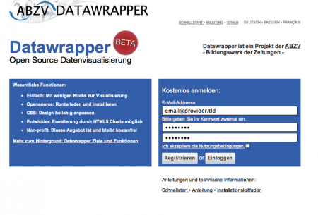
Datawrapper is now live. It is an open source, easy to use data visualization tool. It's beta, but is works and first users like it. We had 5000 visitors in the first three days, from all over the world. Feels great.
Go, give it a try: http://www.datawrapper.de